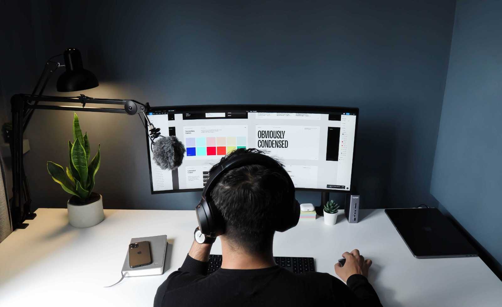
In this blog post, discover 5 ways to create effective visuals using key principles of the psychology of design. Design is a vital element of communication that helps convey information to an audience. The study of how people perceive and respond to visual stimuli, known as the psychology of design, is crucial in creating visuals that connect with your audience.
1. Understand Your Audience
The first step in creating effective visuals is to understand your audience. You need to know who they are, what their preferences are, and what motivates them. This knowledge will help you create visuals that resonate with them and communicate your message effectively. Consider the age, gender, cultural background, and interests of your audience when designing visuals.
2. Use Colors Wisely
Colors can evoke emotions and influence how people feel about a design. Understanding color psychology is crucial when creating visuals. For example, blue is often associated with trust and reliability, while red can evoke passion and excitement. The right combination of colors can help you create a visual that conveys your message and elicits the desired response from your audience.
3. Keep It Simple
Simplicity is key when it comes to effective design. People have limited attention spans, so you need to make sure your visuals are easy to understand at a glance. Avoid clutter and unnecessary elements that can distract from your message. The simpler the design, the easier it is for people to remember and connect with your message.
4. Use Hierarchy to Guide the Eye
Hierarchy refers to the order in which elements are presented in a design. By using hierarchy, you can guide the viewer’s eye to the most important elements of your visual. For example, using a larger font size or a bolder color for the headline can make it stand out and grab the viewer’s attention. This technique can help you communicate your message effectively and ensure that your audience understands the most important points.
5. Use Contrast to Create Visual Interest
Contrast is the difference between two elements in a design. Using contrast can create visual interest and help certain elements stand out. For example, using a dark background with light-colored text can make the text stand out and be easier to read. Using contrasting colors, sizes, or shapes can also create a visually appealing design.
In conclusion, the psychology of design is a powerful tool that can help you create effective visuals that connect with your audience. Understanding your audience, using colors wisely, keeping it simple, using hierarchy to guide the eye, and using contrast to create visual interest are all important principles to keep in mind when designing visuals. By applying these principles, you can create impactful designs that communicate your message effectively and leave a lasting impression on your audience.
Interested in knowing how to design from scratch, check out my previous post.
You can follow me on social media via the following links: IG, LinkedIn
View my portfolio on Behance.
